SPRING: Initial structural lines for the Cathedral outline.
After using the structural lines to help craft the right shapes to draw the cathedral, I hand rendered all the detail and erased the structural lines after.

I drew the outline using a photograph foe reference, The pieces are all done using my Wacom Intuos 4 graphic tablet and Photoshop CS5.
 After the lines were all done i decided to use a faded photo of old limestone brickwork for a texture layer under the Cathedral and then making the cathedral layer transparant by clicking on the 'multiply' option under layer type.
I did the same thing with a brick path image , using it to fabricate my path layer.
I then coloured the trees bushes and houses in the background.

Using the airbrush tool, I set up s large brush size and low opacity and flow to get a clear sky blue. After that I added a colour for the grass and combined it with the grass texture layer.
I Then painted in the clouds and put in a dude riding his bmx across the path. i really like these pieces and might develop them further, adding people ect.Oh I almost forgot, I also added some show on the brickwork of the side of the cathedral, as well as some light source on the front of the cathedral, it's the little things.
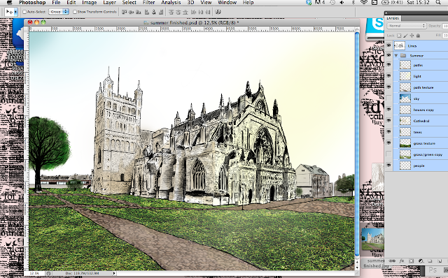
SUMMER: for summer, went for a slightly brighter colour pallet . I added some bright green shrubbery and a bright ray of yellow sun light on the face of the cathedral.

then I finally used a gradient for the sky.
 AUTUMN: As I already had the linework done for the initial season of spring I could now use it for every season adn just build the other elements like colour, textures, light, tone and shadow.
Later down the road I changes the sky and darkness levels of the layers so they would be less bright, After that I added a photo of a storm that I had taken a while back, and cut out the clouds and placed them on top of the sky layer. I also changed the sky colour to a darker grey.
At the very end I made some finishing touches, Namely the light coming through the clouds onto the grass and the leaves blowing in the wind, I can't decide which one of these seasons is my favourite but I is between the Autumn season and the winter season, because the elemental factors are bold and more evident.
WINTER: For winter The tricky part would be the snow the other layers were just variations of previous ones.
I used a sample of a photograph of a sky after it had snowed for this season.
After the sky was in, I hand painted in the snow on a transparant surface layer, using the airbrush tool.
I used a another snow photo as the ground layer, this give the season a nice realistic look, whilst not being too superficial.
Finally I added a noise layer and played with the motion blur and gausian blur options to make some variations of falling snow.


No comments:
Post a Comment